Your Dashboard — Understanding the Upcoming Page
Getting-started Beginner
Your Command CenterThe Upcoming page is the first thing you see when you log in to ShutterTime. It is your personal photography forecast — a rolling 7...
13 min read
Published February 14, 2026
Your Command Center
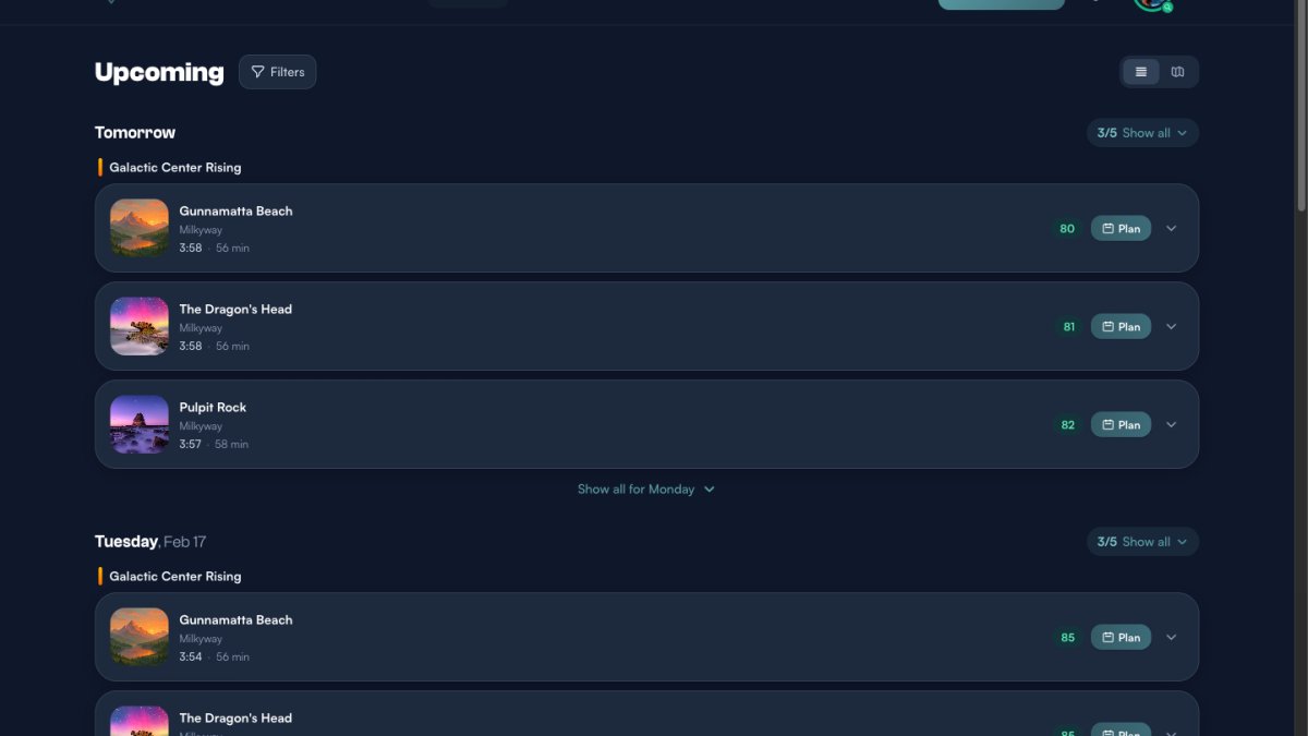
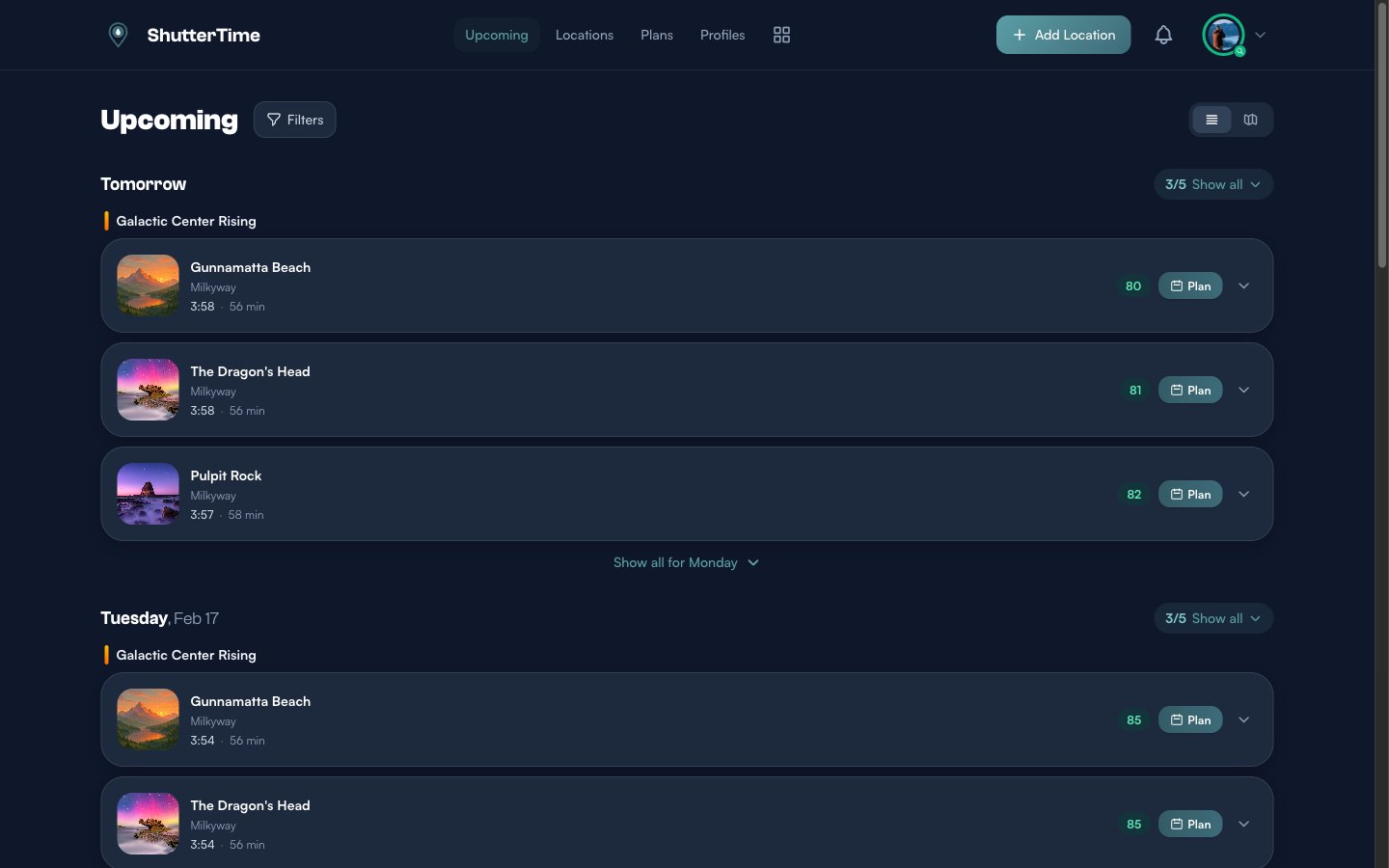
The Upcoming page is the first thing you see when you log in to ShutterTime. It is your personal photography forecast — a rolling 7-day view of every opportunity that meets your minimum score threshold across all of your saved locations.
ShutterTime fetches fresh weather data multiple times a day, runs it through your attached photography profiles, and presents the results as a timeline of scored opportunity cards grouped by day. The higher the score, the better the predicted conditions for that style of photography.
Reading Opportunity Cards
Each opportunity card shows you everything you need at a glance:
- Location thumbnail and name — the photography spot, which is a clickable link to the full location page
- Profile name — which photography profile generated this score (e.g. Milkyway, Sunset Low Tide, Midday Sunny)
- Time and duration — when the opportunity starts and how long the optimal window lasts
- Colour-coded score badge — a number from 0 to 100 indicating how well conditions match your profile
The score badge uses colour to communicate quality at a glance:
- 90–100 — Exceptional conditions (green) — drop everything and go
- 80–89 — Great conditions (teal) — well worth the trip
- 70–79 — Good conditions (amber) — solid shooting if nearby
- Below 70 — Fair conditions (grey) — only shown if you lower your minimum score filter
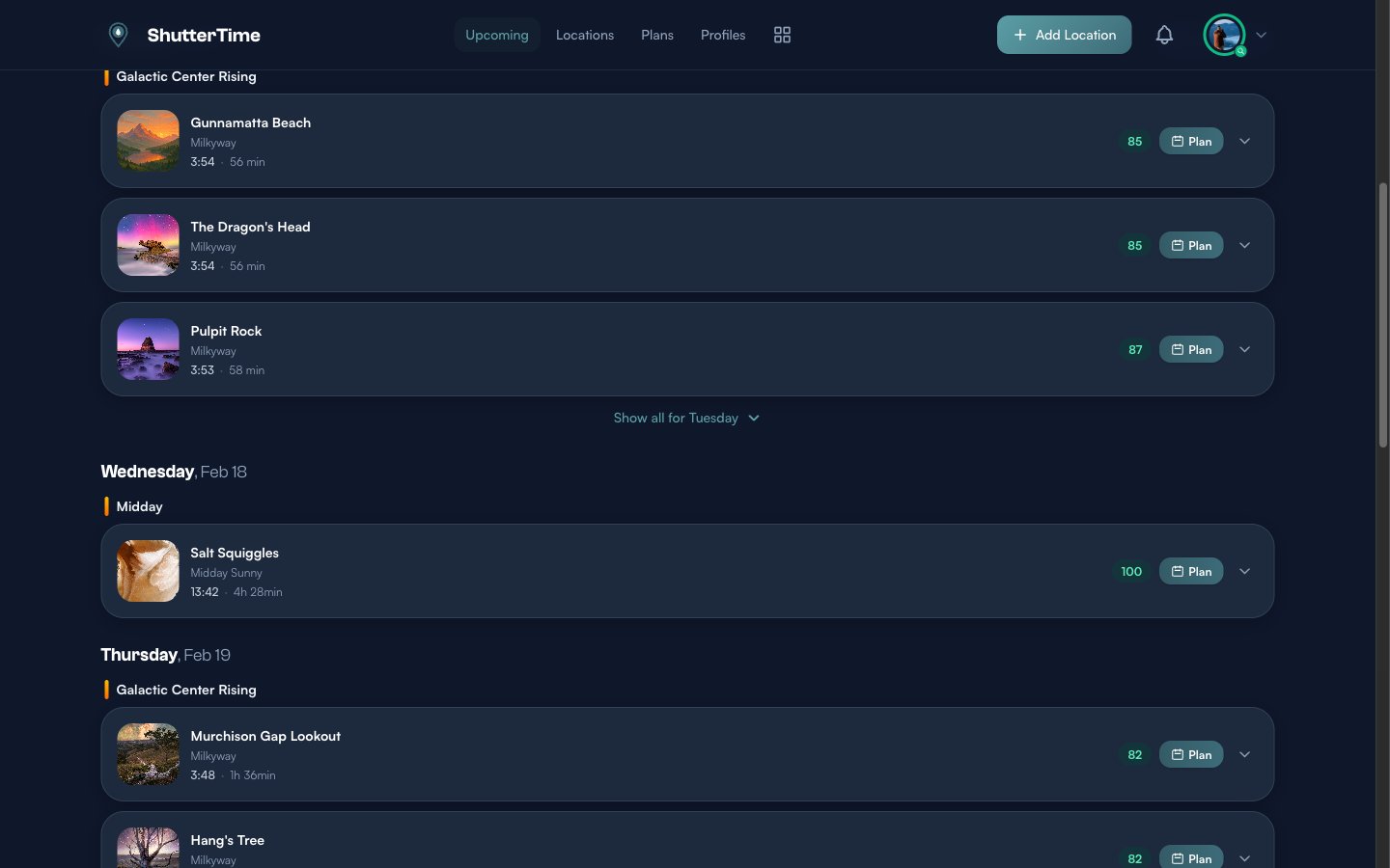
Notice how opportunities are grouped by day and then by phase — the coloured label above each group (like "Galactic Center Rising" or "Midday"). Phases represent astronomical or time-of-day windows, so all opportunities within the same phase share similar lighting conditions.
Collapsible Day Groups and Show All
When a day has many opportunities, ShutterTime only shows the top three by default. This keeps the dashboard scannable — you can quickly glance at the best opportunities for each day without scrolling through dozens of cards.
You will notice two controls that let you reveal more:
- "3/5 Show all" — This button appears in the top-right corner of a day header. The numbers tell you how many cards are currently visible versus the total available. Click it to expand and show every opportunity for that day. Once expanded, it changes to "5 Less" so you can collapse back down.
- "Show all for Monday" — This button appears below the visible cards at the bottom of a day group. It does the same thing — reveals all hidden opportunities for that day, including opportunities from other time phases that did not make the top three.
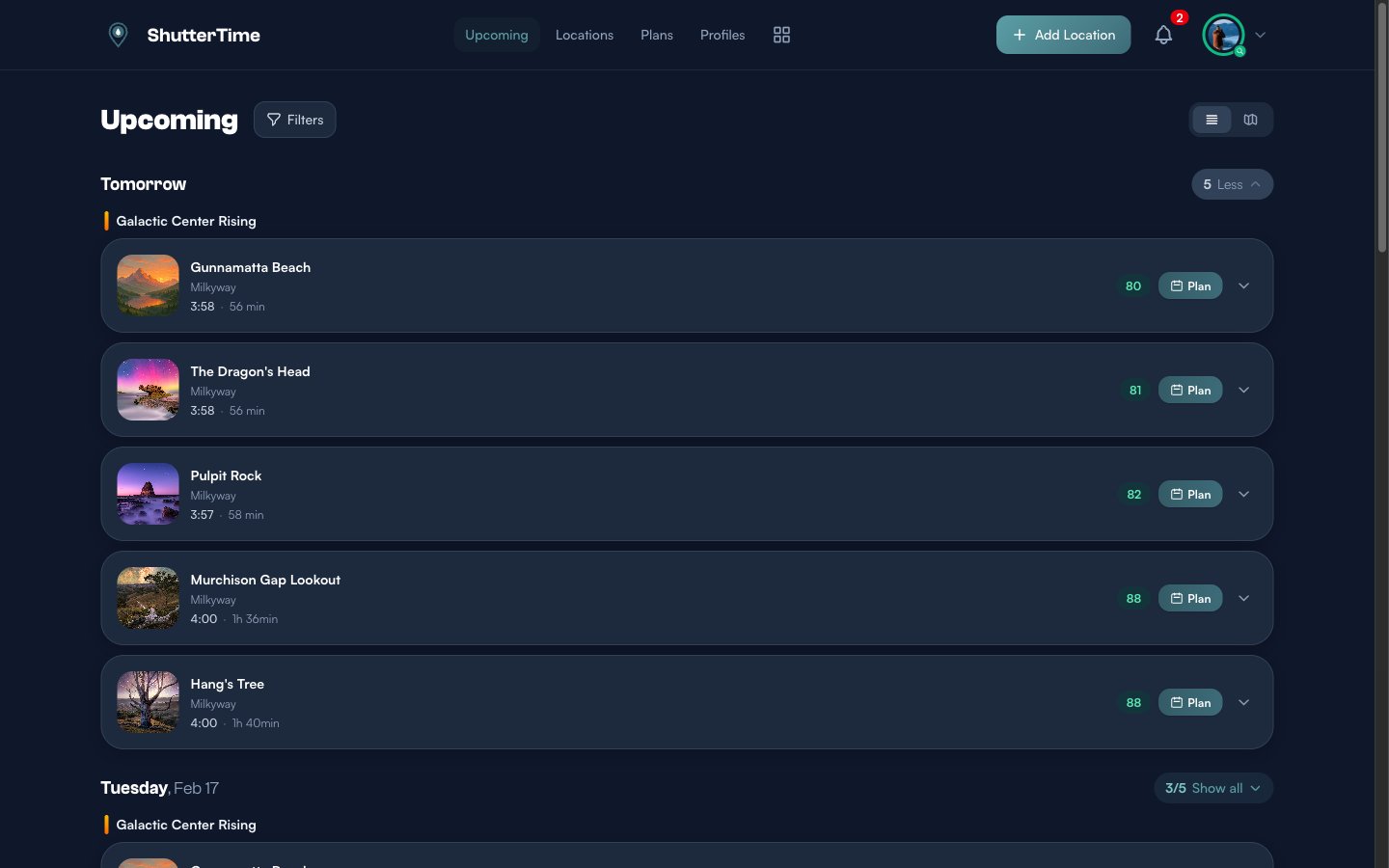
In this example, expanding Tomorrow reveals two additional locations — Murchison Gap Lookout and Hang's Tree — both scoring 88, which were hidden in the default collapsed view. The dashboard collapses cards to keep the 7-day forecast manageable, but you can always expand any day to see everything.
Expanding the Details
Every opportunity card has an expand button (the down-arrow icon on the right). Click it to reveal a detailed conditions breakdown without leaving the dashboard.
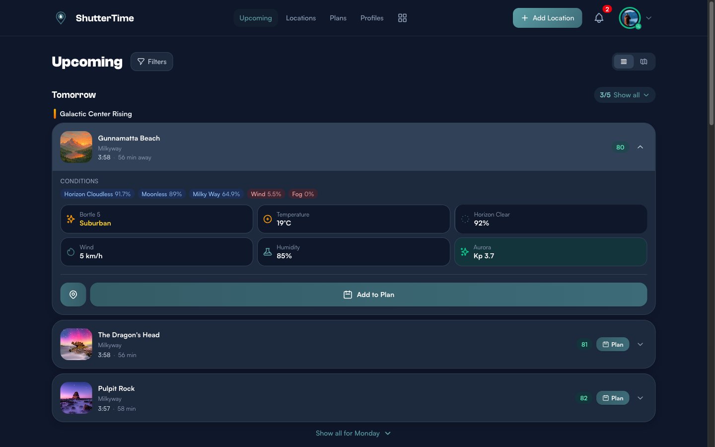
The expanded view contains several layers of information. Let us walk through each one.
Condition Pills
At the top of the expanded card you will see a row of coloured pills — one for each scoring factor that your photography profile uses. They are sorted from highest to lowest percentage, so the strongest contributors appear first.
Each pill shows:
- The condition name — for example Horizon Cloudless, Moonless, Milky Way, Wind, Clear Cloud, Aurora, or Fog
- A configuration hint in parentheses when relevant — such as (KP>5) for aurora or (alt>20°) for Milky Way altitude
- The percentage score for that factor — 100% means ideal, 0% means the condition is completely unfavourable
The pill colour tells you how important that condition is to the overall score:
- Red (Show Stopper) — A critical requirement. If this drops to zero, the entire score may collapse regardless of other factors.
- Orange (Must Have) — A key requirement with significant weight in the final calculation.
- Yellow (Nice to Have) — A bonus factor that improves the score but is not essential.
- Grey (Penalty) — A negative factor that reduces the score when present (e.g. wind or fog).
Environmental Data Tiles
Below the condition pills is a grid of data tiles showing raw environmental measurements. Which tiles appear depends on the conditions your profile uses and the data available for that location. Here is every tile you may see:
- Bortle Scale — The light pollution level at this location, from Bortle 1 (pristine dark sky) to Bortle 9 (inner-city sky). This only appears for profiles that include a Milky Way condition. Lower Bortle numbers mean better astrophotography conditions.
- Temperature — The forecast temperature in degrees Celsius at the opportunity time. Useful for planning what to wear and anticipating condensation on lenses.
- Clear Sky — Overall cloud cover as a percentage. "Perfect" means 0% cloud cover. This tile has a coloured left border matching the condition type (red for show stoppers, orange for must-haves, and so on).
- Low Cloud — Low-altitude cloud cover percentage. Low clouds are the most opaque and problematic for most photography.
- Mid Cloud — Mid-altitude cloud cover percentage. These clouds can produce dramatic colour at sunset and sunrise.
- High Cloud — High-altitude cloud cover percentage. Thin high clouds (cirrus) sometimes add texture without blocking too much light.
- Horizon Clear — A pre-calculated percentage measuring how clear the sky is specifically near the horizon. Crucial for sunrise, sunset, and moonrise profiles where obstructions at the horizon ruin the shot.
- Horizon Low / Horizon Mid / Horizon High — Horizon-level versions of each cloud layer. These separate tiles let you see exactly which cloud layer is affecting your horizon view.
- Wind — Wind speed in km/h. Important for long-exposure photography, seascapes, and any situation where camera shake or choppy water matters.
- Humidity — Relative humidity percentage. Very high humidity can cause lens fog, while moderate humidity can enhance atmospheric glow.
- Aurora Kp — The Kp index for geomagnetic activity, ranging from 0 (quiet) to 9 (extreme storm). The tile background changes colour to reflect severity: quiet (grey), minor activity (light green), moderate storm (green), or strong storm (teal). If a NOAA G-scale rating exists (G1–G5), it appears as an additional label.
Tide Chart
When your profile includes a tide condition (such as High Tide or Low Tide), the expanded card shows a live tide chart below the data tiles. This chart displays a 12-hour window of tide heights centred around the opportunity time.
The chart features:
- A smooth teal curve showing the tide height over time, with a gradient fill beneath it
- High tide markers (blue dots) and low tide markers (teal dots) labelling the exact height in metres at each extreme
- A vertical dashed line for the current time (if within the chart range)
- A pulsing teal dot at the opportunity time, showing the interpolated tide height at the exact moment of the shoot
- A direction badge reading "Rising" or "Falling" with the current height in metres
If detailed tide chart data is unavailable for a location, a simpler fallback shows just the tide direction (rising or falling) and the current height.
Aurora Forecast Timeline
When your profile includes an aurora condition, a dedicated Aurora Forecast section appears with a colour-coded bar chart showing the predicted Kp index in 3-hour time slots across the day.
The bars are coloured by intensity:
- Grey (Kp 0–2) — Quiet, no visible aurora
- Green (Kp 3–4) — Potentially visible at high latitudes or with low Bortle
- Amber (Kp 5–6) — Strong activity, likely visible
- Rose (Kp 7+) — Severe storm, visible at lower latitudes
Daytime hours are overlaid with a diagonal stripe pattern so you can immediately see which active periods fall during usable nighttime hours. The bar for the opportunity time slot glows with a pulsing highlight, and a white ring marks the current time slot.
On larger screens, a stats panel appears alongside the chart with four summary boxes:
- Peak — The highest Kp value forecast for the day
- Status — A quick label: Quiet, Visible, Strong, or Severe
- Visible — Number of nighttime hours where Kp reaches 3 or above
- Best — The time of the strongest nighttime Kp reading (e.g. "11pm")
Data Quality Warnings
If there are any data quality issues — such as stale weather data or missing measurements — a yellow Data Quality Warnings banner appears near the bottom of the expanded card. Each warning shows a severity badge (critical, warning, or info) and a short message explaining the issue. When warnings are present, the score badge also appears slightly muted with a dashed border to signal that the score may be less reliable.
Action Buttons
At the bottom of every expanded card you will find action buttons:
- Location pin icon — Opens the full location detail page where you can explore weather tabs, tide charts, night sky data, and more
- Add to Plan — Creates a photography plan for this opportunity (or View Plan and Cancel Plan if a plan already exists)
Filtering Opportunities
Click the Filters button next to the "Upcoming" heading to open the filter panel. This gives you fine-grained control over which opportunities appear:
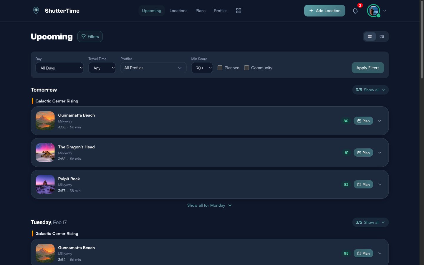
- Day — Jump to a specific day instead of scrolling through the entire week. Choose "All Days" to see the full 7-day forecast, or pick a single day like "Tomorrow" or "Wednesday, Feb 18".
- Travel Time — Filter by maximum travel time from your home base. If you only want to see locations within 30 minutes, an hour, or two hours of driving, set this filter.
- Profiles — Narrow results to a specific photography profile. Useful if you are only interested in milky way opportunities or only sunset shots.
- Min Score — The minimum score threshold. By default this is set to 70+, which means only opportunities scoring 70 or higher appear. Raise it to 80+ or 90+ to see only the best, or lower it to 50+ or 60+ to see more options.
- Planned — Check this to show only opportunities you have already added to your plans.
- Community — Check this to include opportunities from community-shared locations alongside your own private locations.
Click Apply Filters to update the results. Your filter preferences are remembered for the session.
Planning a Photo Session
When you spot an opportunity you want to commit to, click the Plan button on the card. ShutterTime instantly creates a plan for that location and time window.
Once a plan is added, the card's border turns green and the buttons change to View Plan and Cancel Plan:
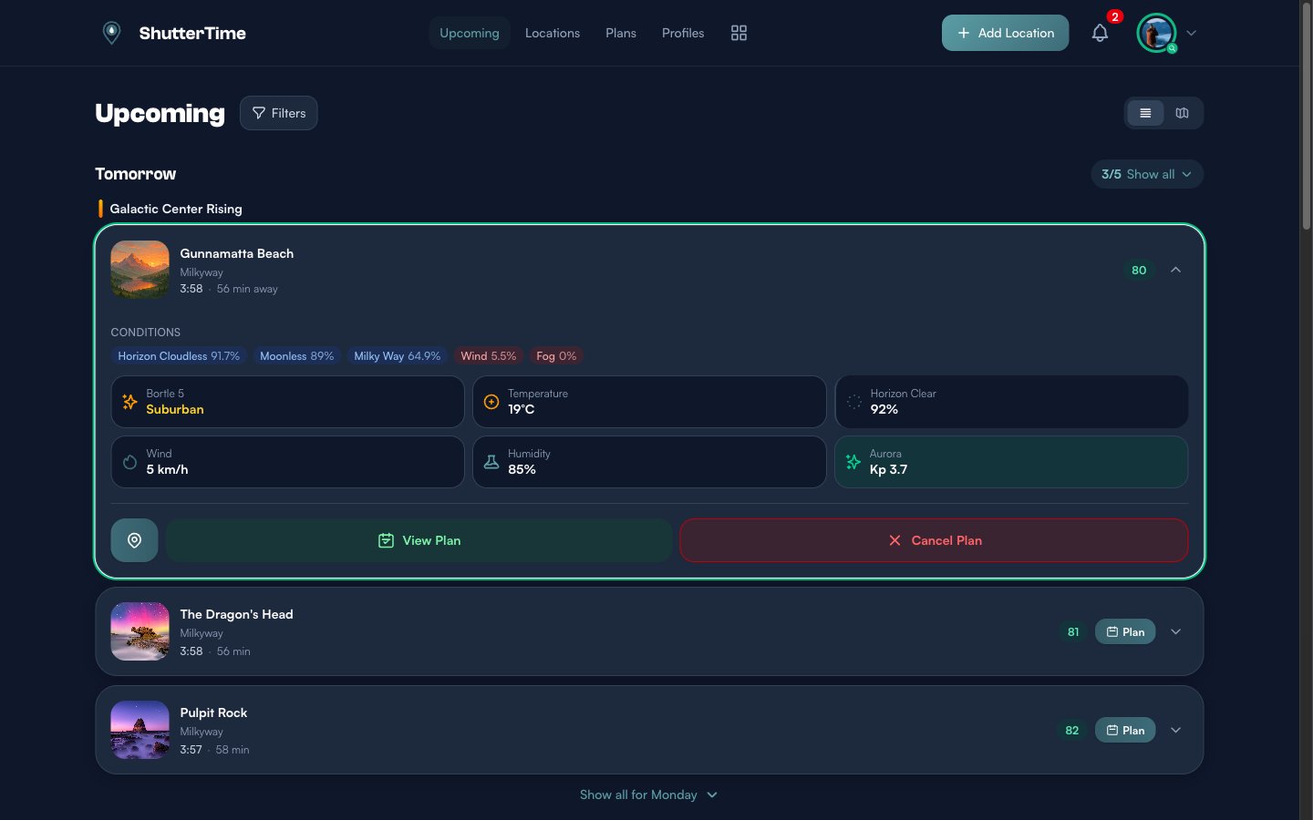
- View Plan — Takes you to the full plan detail page where you can add notes, set reminders, and see the complete forecast.
- Cancel Plan — Removes the plan (with a confirmation dialog).
Plans integrate with ShutterTime's reminder system. Depending on your notification preferences, you will receive alerts before your planned session — so you never miss a great opportunity.
Cancelling a Plan
Changed your mind? Click Cancel Plan and a confirmation dialog appears:
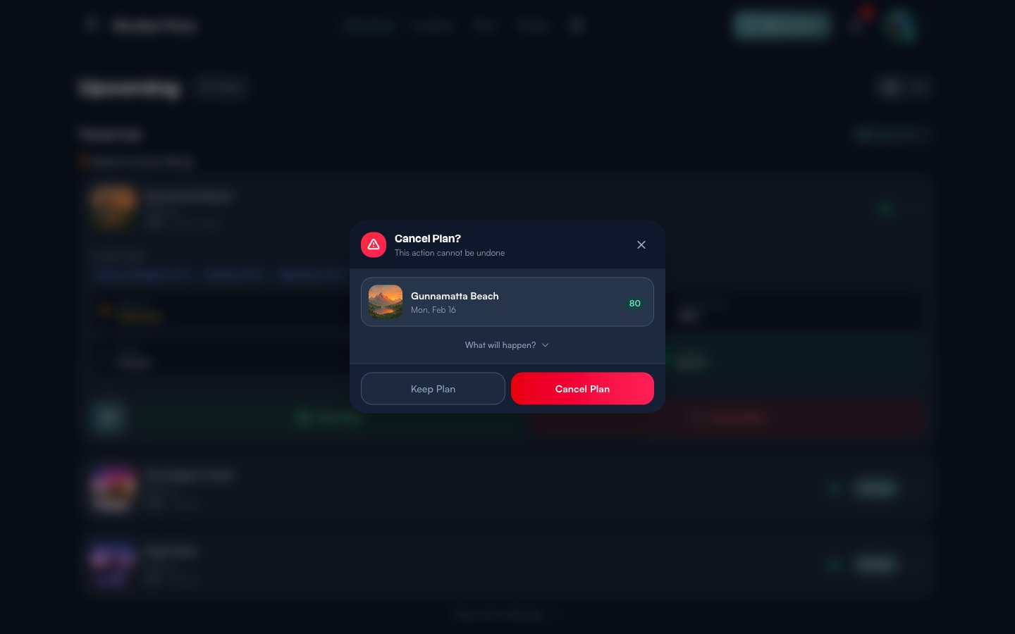
The dialog shows you which location and date you are about to cancel, along with the score. You can also click What will happen? to see a summary of what gets removed. Click Cancel Plan to confirm, or Keep Plan to go back. A toast notification confirms the removal.
Plan Conflicts — The Swap Dialog
ShutterTime allows only one plan per phase and day. If you already have a plan for a particular time window — say Galactic Center Rising on Monday — and you click Plan on a different location in the same phase and day, a Plan Conflict dialog appears:
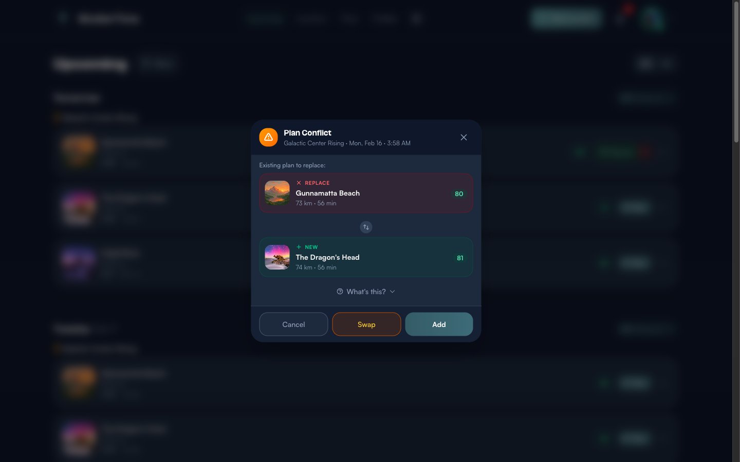
The dialog shows both locations side by side — the existing plan on top (marked Replace in red) and the new location below (marked New in green). Each card displays the location thumbnail, name, distance, travel time, and score so you can compare at a glance.
You have three options at the bottom:
- Cancel — Do nothing. Your existing plan stays as it is.
- Swap — Replace your existing plan with the new location. The old plan is removed and the new one takes its place.
- Add — Keep both plans. This overrides the one-per-phase limit and adds the new location alongside your existing plan, so you can plan for multiple locations in the same time window.
Click What's this? to read a brief explanation of why the conflict occurred. This feature ensures you are always aware when plans overlap, so you can make an intentional choice rather than accidentally double-booking a time slot.
Switching to Map View
In the top-right corner of the dashboard, you will see two small toggle buttons. The first is the default list view; the second switches to map view.
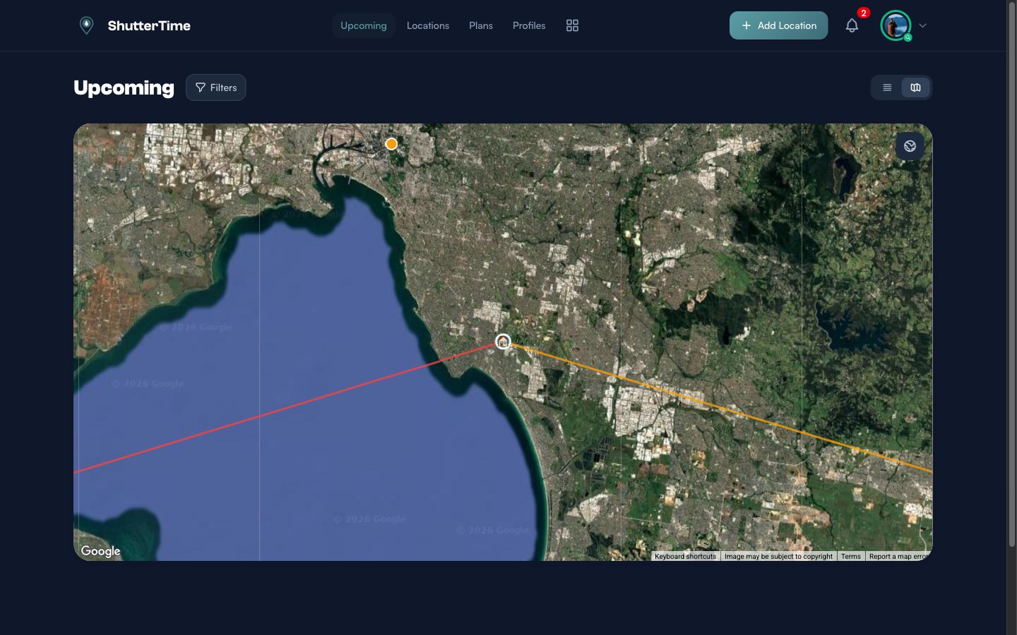
Map view displays all your upcoming opportunities as markers on a satellite map. When you click on any location marker, coloured directional lines appear radiating from that spot — the orange line shows the sunrise direction and the red line shows the sunset direction for that day. These lines update for every location you click, making it easy to visualise how the sun will move relative to your chosen vantage point. This is especially useful for planning compositions where the position of the sun matters — for example, checking whether the sun will set behind a headland or rise over open water.
You can interact with the map just like any Google Maps view — zoom in and out, drag to pan, and switch to terrain view using the button at the bottom right. Click any location marker to see a quick summary card:
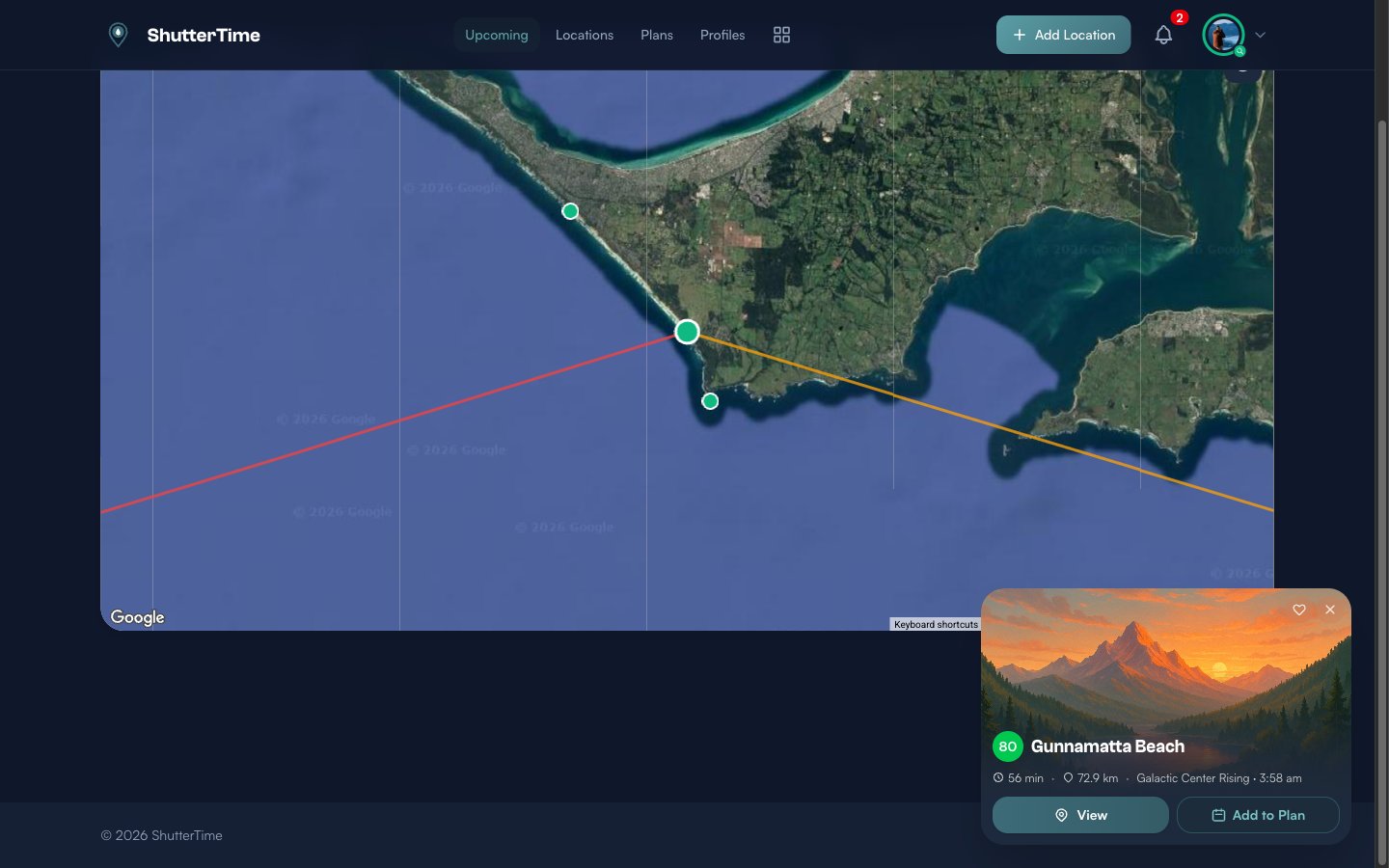
The popup card shows the score, travel time, distance from home, the current phase, and buttons to View the location detail page or Add to Plan directly. You can also favourite the location using the heart icon.
Navigating to Locations
Every location name on the dashboard is a clickable link. Click it to open the full location detail page, where you see the complete forecast, all attached profiles, weather and tide data, the map, and more.
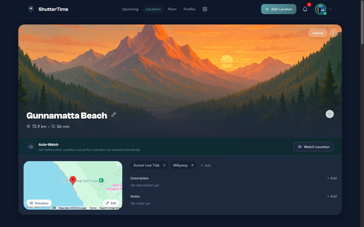
From the location page you can explore detailed tabs for Weather, Sun, Tides, Night Sky, Plans, Spots, History, and Community. You can also enable Auto-Watch to receive automatic notifications when conditions at this location meet your target score.
The Community Banner
At the very bottom of the Upcoming page, below all your opportunities, you will find a Browse Community Locations banner.
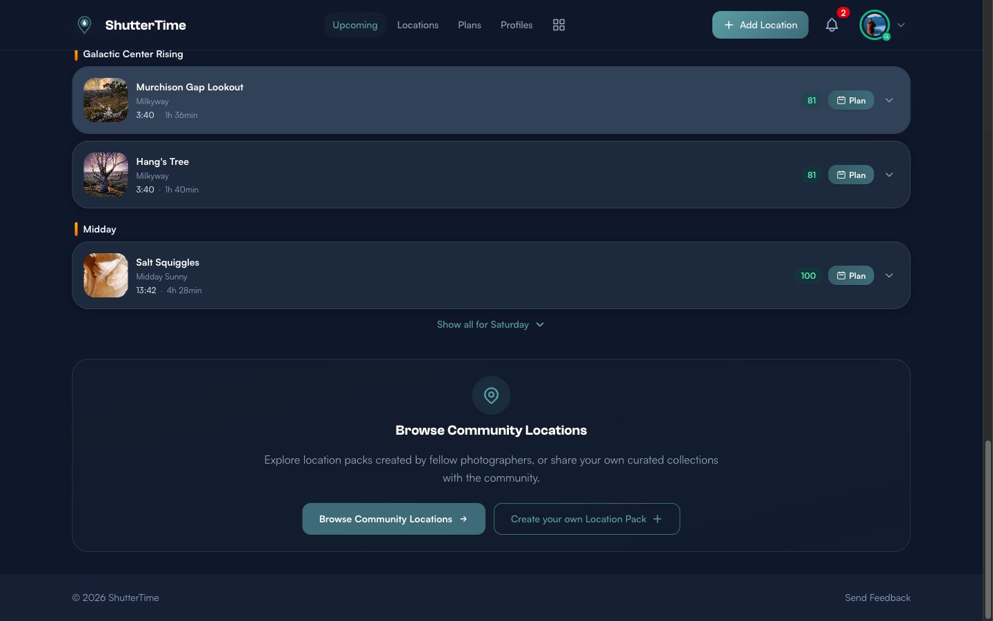
This is your gateway to discovering new photography spots shared by fellow ShutterTime users. Community locations are organised into packs — curated collections of spots that work well together (like "Sydney Sunrises" or "Blue Mountains Views"). You can browse packs, install them to add those locations to your collection, or create your own pack to share your favourite spots with the community.
What's Next?
Now that you understand the dashboard, here are some things to explore:
- Add more locations — Build a collection of your favourite photography spots to increase the number of opportunities on your dashboard
- Create custom profiles — Tailor scoring conditions to match your exact preferences for different styles of photography
- Manage your plans — Review upcoming plans, set reminder times, and track your photography sessions
- Browse the community — Discover location packs shared by other photographers and install them with one click